Unit 4 - Visual Literacy
Why is being visually literate important for your students?
Let me start with why visual literacy is important for anyone? The two most important factors that I will like to reflect upon were mentioned by Mr. Brian Kennedy (TED). One that 90% of all information we take in is through visual means and second that it is a universal language. Now why are these two things important for my students or anyone for that matter?
When 90% of the information you take in is visual, how can we expect a student to be the best they can be if they can comprehend, analyze, evaluate and explain less than 10% of the information they collect? To give our students the best chance at learning, finding their strengths and achieving the most that they can, we have to help them decode the 90% of information they collect through visual means. It is not only about being able to understand the visual world, it is also about being heard! When everyone around us takes 90% of the information through visual means, I can not expect to be heard if I am missing the opportunity to speak to 90% of their input faculty. My students have many ideas to share, they need to feel part of the community to hear and be heard, to discuss, to collaborate, to belong. This will only be possible when they are able to create visual to communicate their thoughts and ideas.
Similarly, the fact that visual communication is universal becomes even more important when we talk about the world being a global village especially, in this age of the boom of digital media. Today's professionals and youth are communicating and collaborating with people on the other side of the world, people who they probably will never meet, people who speak a different language. Visual media provides the language that eliminates these barriers to make international communication possible and authentic. As the world becomes more united through the digital world, as our classrooms become examples of global collaboration amongst educators, the need to have students to can communicate visually will become more and more important.
In my classroom, as a special educator, the need for visual literacy becomes essential when I have students in 9th and 10th grade who are unable to decode the written word. I was amazed to learn that one of my 9th grade students, who is a non-reader i.e. at a pre-reading level is the best critical thinker in my class where I have students who read 6 levels higher than this particular student. When I presented him with a visual and read out the captions or heading, he was able to analyze and explain the events better than most students. I realized that this particular student had learned to compensate and had a higher competence in visual literacy to make up for the fact that he couldn't even read his schedule to read room numbers and which subject class he had next. He navigated the school using the picture schedule his Special Education teachers created for him. Consider him and his classmates who read at levels ranging from pre-reading to 6th grade and imagine teaching them high school Chemistry. That is the task I have ahead when school re-open in Fall. Top this off with the fact that Chemistry is very abstract; experiment results are observable but what is causing those results is not. All concepts that Chemistry is based on are a leap of faith for these students. They have to believe, what we are saying is correct as there is no way to check what an atom looks like, proven by the fact that even Scientists keep revising their idea of what it looks like! The only way I can make these concepts perceivable for my students is through visuals and the only way for them to understand these concepts is through being visually literate.
Book Cover and Explanation of the Project
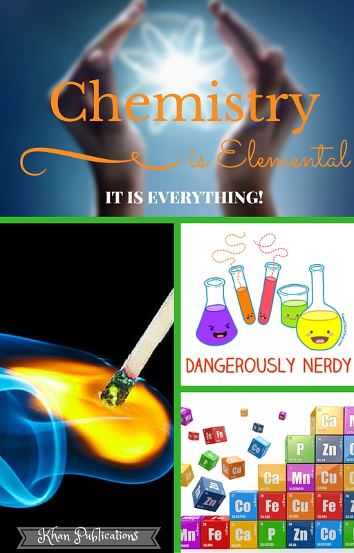
A playful book cover I designed for a Chemistry text book. Students generally think of Chemistry as a difficult and dry subject which affects motivation even before they have actually tried to learn. The idea behind keeping the cover playful with bright colors, soft lines and personified lap supplies is to eliminate undue stress and invite students to open their minds for a fun exploration. The close-up image of a lighted up matchstick is visually intriguing and invites questions or the will to find out more.
I have also purposely selected green as the background color. On one hand it is color generally associated with Science, life, fresh and in general positive, but for some reason it is not a color that comes to mind when one thinks about Chemistry. The idea is to maintain the positive codal association of green and extend it to emphasize the fact that Chemistry is one of the Sciences.
The cover has two different text sets. The first is the title which along with its background image of an atom, compliments the colors of the flame creating a visual balance in the composition. The font, although formal, is fluid to create softness, again de-emphasizing the popular image of Chemistry. The statement 'Chemistry is Elemental' is almost casual making it even more of a fact as if it is not up for debate - an agreed upon fact. Then comes the sub-statement 'It is everything'; although, written in a smaller size, this statement is dominating in the font style and the Boldface of the font. The second set of text is 'dangerously nerdy' is part of a playful personified composition of lab supplies making both the words 'dangerous' and 'nerdy' appealing.
Although the images and words are serving the above mentioned purposes in this composition, all images and the words are content specific and invite deeper though. 'Chemistry IS elemental, it all starts with the periodic table of elements! It is everything, it REALLY is! 'Dangerously Nerdy' of course, it is dangerous, it is nerdy and its OK even desirable for students to be dangerously nerdy!
